An Instructor working on a Course was doing a lot of navigating. Edit the curriculum on one screen, jump to a different URL to enrol students, jump again to change the price or visibility. Three screens, three headers, three back buttons — for what is, in the Instructor’s head, one thing: this Course.
This slice makes the mental model and the UI agree. One Course, one page, three tabs.
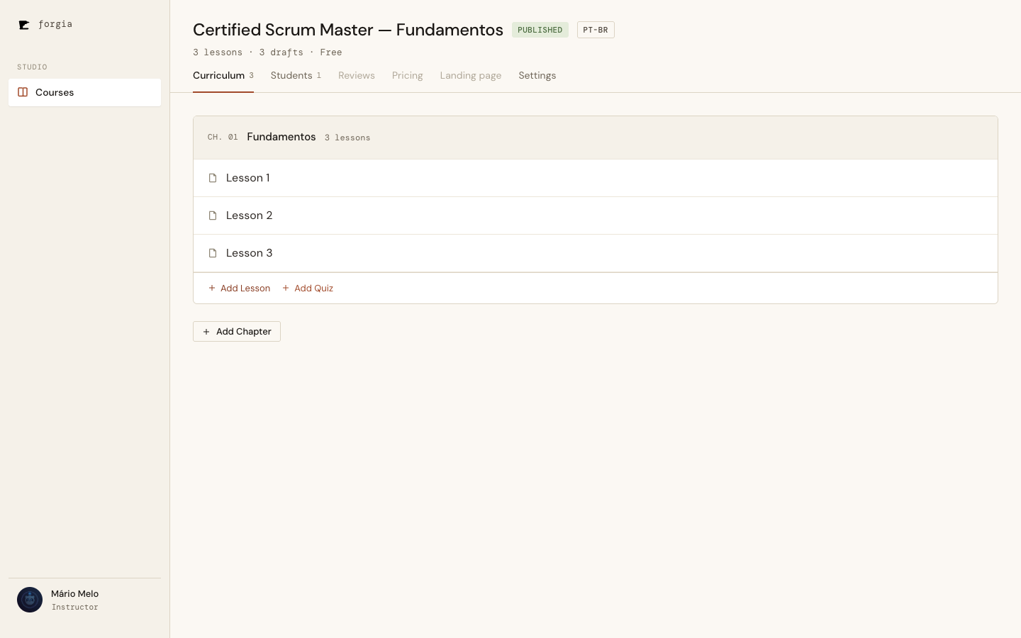
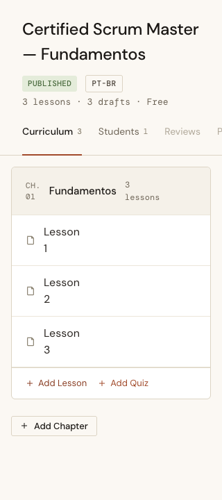
The header at the top — title, status badge, language badge, the lessons · drafts · price meta line — is shared by every tab. The tab strip below it switches what’s underneath. Curriculum, Students, and Settings are live; Reviews, Pricing, and Landing page are visible-but-disabled “Coming next” placeholders, so the shape of where this is going is on screen without pretending to work yet.
The rule: relocate, don’t rewrite
The temptation in a consolidation like this is to “improve while you’re in there.” We didn’t. The scope was explicit: each active tab is today’s screen, moved unchanged. The Curriculum tab is the existing chapter/lesson editor with all its modals. The Students tab is the existing batch-enrol flow — add people, preview each row’s status, send, see the summary.
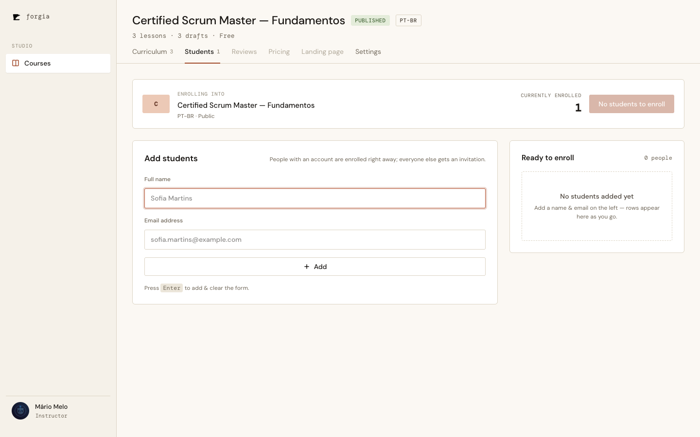
The Settings tab is the existing Course form, untouched.
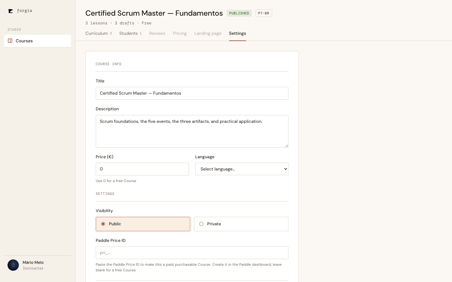
Keeping the feature surface frozen is what made this a one-slice change instead of a quarter-long rewrite. The diff deletes three LiveViews and three templates and adds one of each; the behaviour inside the tabs is byte-for-byte the old behaviour, which the old tests — repointed at the new routes — still prove.
One LiveView, one route per tab
The structural decision: all three tabs are backed by a single LiveView (CourseLive.Show), with one route each.
flowchart LR
    A["/courses/:id"] -->|live_action :curriculum| S[CourseLive.Show]
    B["/courses/:id/students"] -->|live_action :students| S
    C["/courses/:id/settings"] -->|live_action :settings| S
    S --> H[Persistent header:
title · badges · counts · Publish]
    S --> P{live_action}
    P -->|:curriculum| PC[Chapters & lessons]
    P -->|:students| PS[Batch enrol]
    P -->|:settings| PG[Course form]
Each tab has its own URL, so every tab is bookmarkable and deep-linkable — open /courses/14/settings cold and you land on Settings, not on Curriculum with a click to do. Because all three routes resolve to the same LiveView module, switching tabs is a push_patch, not a navigation: the URL updates, live_action flips, the panel under the header swaps — and the process never remounts. The header doesn’t flicker because it was never torn down.
The settings form posts back through a live_component; on save it notifies the parent, which refreshes the Course assign so the header’s badges and meta line reflect the change without a reload.
Don’t break the links that already exist
Three old URLs were out in the wild — in bookmarks, in the Courses index “manage” link, in the “back to curriculum” links inside the lesson and quiz sub-editors. Consolidating the routes would 404 every one of them. So the legacy routes don’t disappear; they redirect to their new homes:
get "/courses/:id/edit",       CourseRedirectController, :settings
get "/courses/:id/curriculum", CourseRedirectController, :curriculum
get "/courses/:id/enroll",     CourseRedirectController, :students
The internal links that we own — the index’s manage link, the sub-editor back buttons — were repointed straight at the canonical URLs, so they don’t bounce through a redirect. The redirects exist only to catch the links we don’t control.
The Publish button moves to where you look
On the old curriculum screen, Publish lived down in the editor. But publishing is a Course-level act, not a curriculum-level one — it belongs with the title and the status badge, not next to “Add chapter.” So it moved into the persistent header, and it only appears while the Course is a Draft.
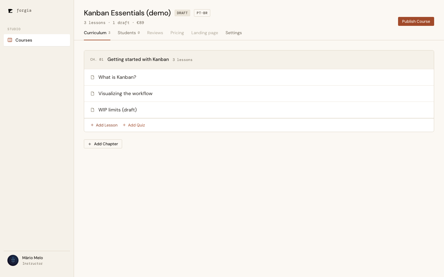
Click it and the status flips to Published, the badge updates, the button vanishes — all in place, no navigation. The same header that shows 1 draft · €89 here shows Published and no button the instant the Course goes live.
The breadcrumb we deleted on purpose
The design mockup carried a breadcrumb — Courses › This Course — at the top of the page. We dropped it. In a tabbed layout it’s pure redundancy: the studio sidebar already has a “Courses” link that goes back to the list, and it’s always visible. A breadcrumb that duplicates a permanent nav element is noise. (This is the kind of decision worth writing down precisely because the mockup says otherwise — a future reader diffing the screen against the design file should find the reason here, not a bug report.)
320px, for free-ish
The Definition of Done asks every screen to survive 320px. The tab strip scrolls horizontally, the header wraps, and the two-column enrol layout collapses to one — the studio’s existing responsive tokens did most of the work once the markup followed the design system.
What it added up to
A relocation slice is unglamorous: no new domain concept, no new entity, nothing a Student ever sees. But it’s a real reduction in friction for the person who lives in this product all day, and the structural choices — one LiveView, deep-linkable tabs, redirects that protect old links — are the kind that quietly keep paying off as the disabled tabs (Reviews, Pricing, Landing page) come to life one by one. Each of those is now a route and a panel away, not a new screen.
Covered end to end by mix test (the relocated enrol flow plus a new suite for the shell, the redirects, the header, and Publish), and verified in the browser at desktop and 320px before it shipped.